
My reference making process
Written June 2026
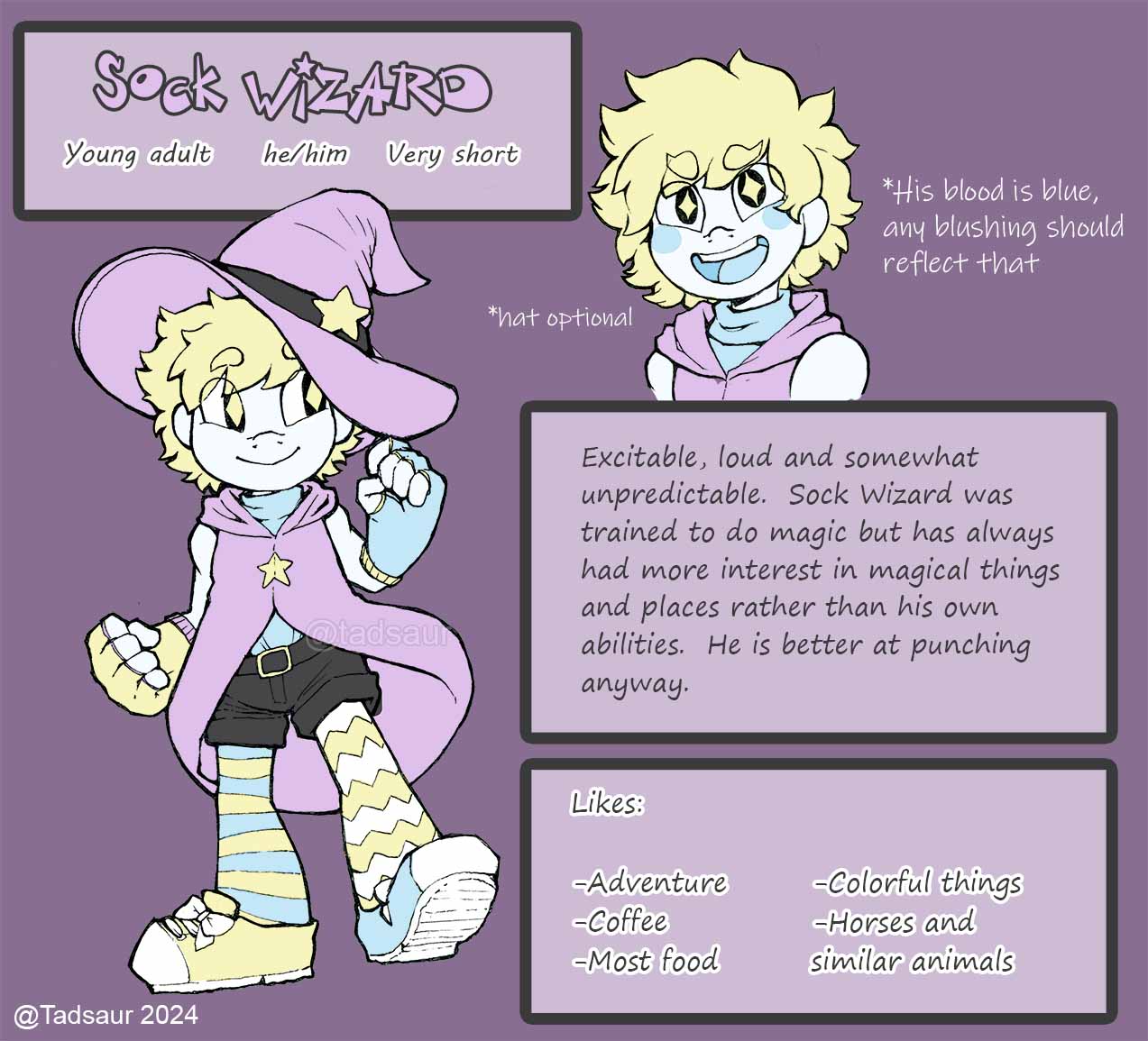
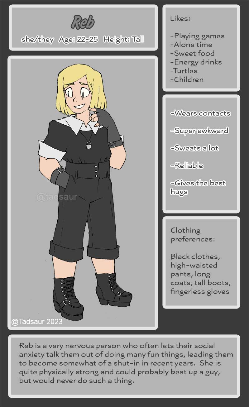
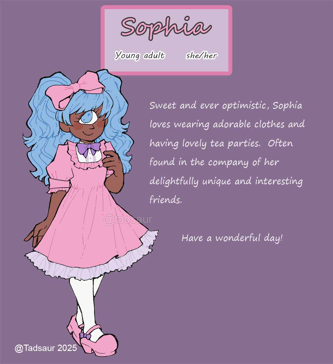
If you've ever looked close at one of my character's Artfight references and wondered "why does it look like that", the short answer is I chose to color them digitally and I am not a digital artist. The long answer is this webpage.
Skipping straight ahead to the finished line art. I'll draw multiple characters on a single page of a sketchbook. This page still has room for another.
I scan the page and put it into Photoshop. I don't like Adobe for a multitude of reasons, but because I use it for my job I'm used to the program and it's easiest for me.
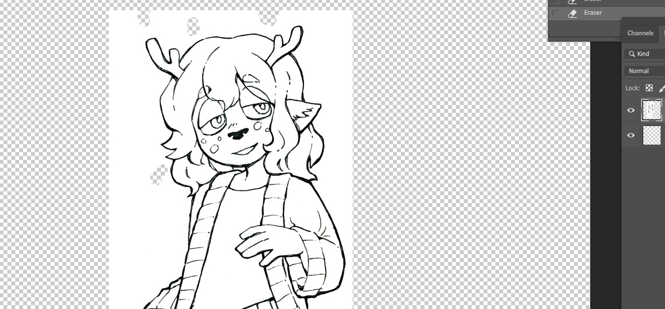
I adjust the levels of the scan to make the lines darker and the background stark white. Clean up little specks.
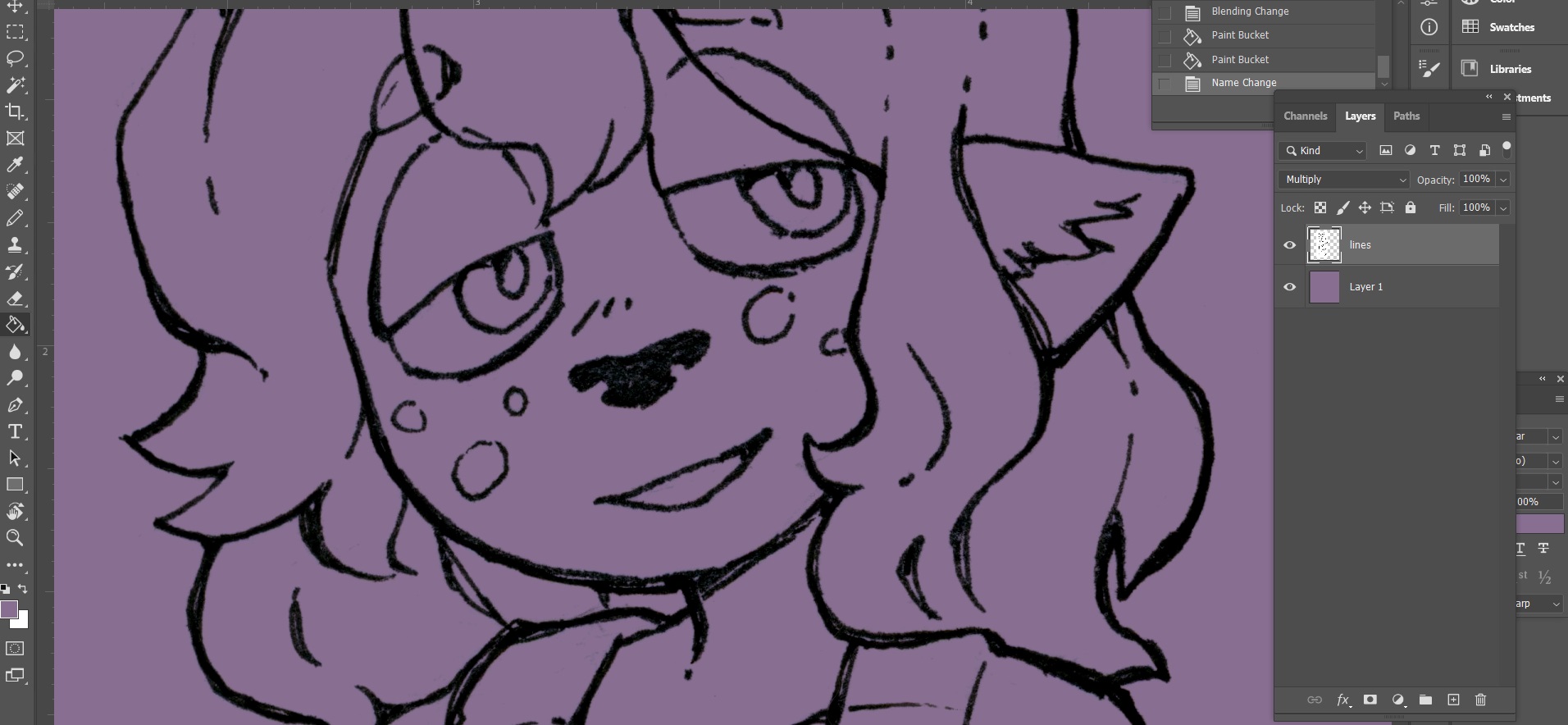
I change the line art layer type to "multiply." It's kinda rough, but good enough for my low standards.
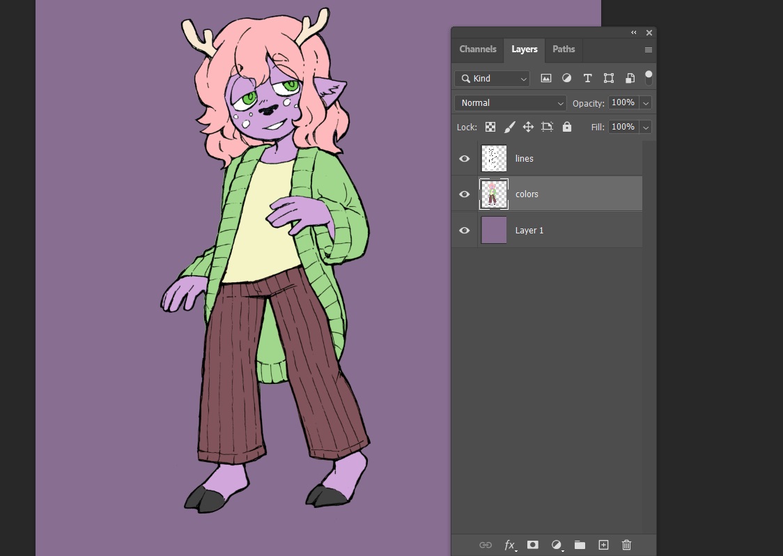
Tediously color in lines... I can kind of make use of auto select tools, but because the lines are rough there's a lot I have to do manually.
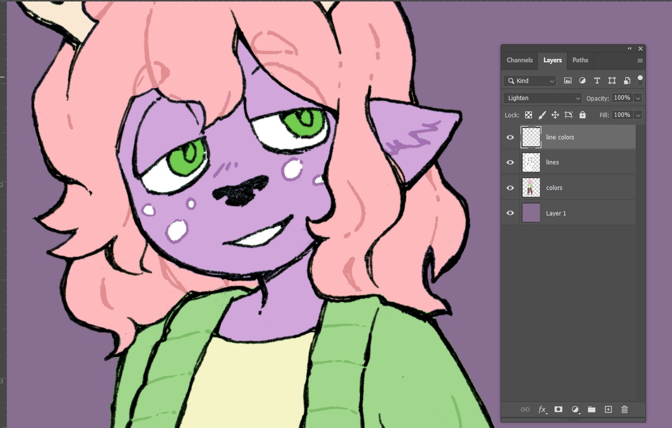
Finally, the only fun part that comes after scanning! I make a "lighten" style layer above my line art layer and slap around colors that I want to change some of the lines to. Changing my inked lines to colored lines is pretty satisfying.
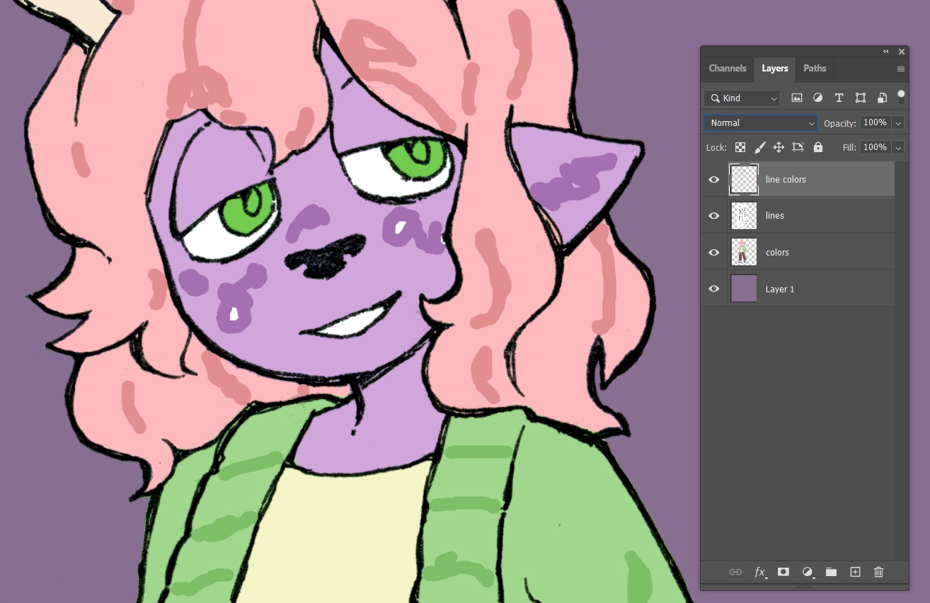
This is what that layer looks like if it's set to normal. It's just blobs. Layer types are kind of magical, aren't they?
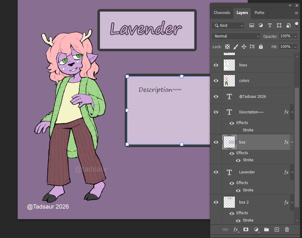
And that's about it! I've got some boxes that are just single color squares with the "stroke" effect turned on, and I've just gotta fill it with something hopefully interesting.
The final step will be exporting it a resolution low enough to hide how crap it looks. (It's also to save on file size and load times, but that's not as funny to say.)
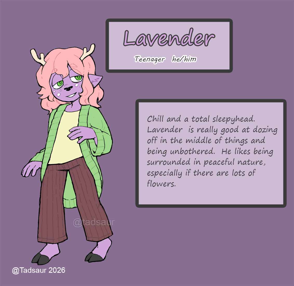
Wow, it looks mediocre! Perfect.
So yeah, I don't know if this is interesting to anyone, but that's how I stumble my way through photoshop to make references for Artfight. My priority is simply to make them as readable to others as possible, which is why I color them digitally despite literally never doing so otherwise.
digital coloring lets me apply a perfectly flat color, any exact shade, without any texture that could distract someone. So while making character references could absolutely be done traditionally, maybe I even will do it that way eventually, this is what works for me right now.
And even if they're not my prettiest work, I know for sure that they serve their purpose. Lots of artists have looked at my scrappy little references and created some truly amazing and perfect depictions of my characters. Sometimes I can't believe how well they capture their whole look and personality.
If you have an Artfight account, I'll direct you to the art I've recieved on Artfight.net so you can see what I'm talking about. I can't overstate how much I love these.